
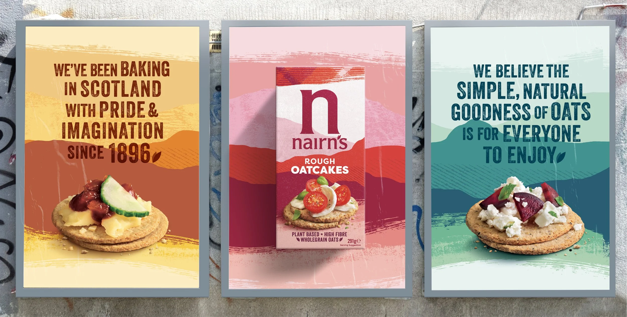
This brand redesign for Nairn’s evokes the Scottish pride and natural goodness that goes into baking their delicious portfolio of oat sweet and savoury snacks.
The redesign brings to life the rugged landscape of Scotland, using colourful hills and textures that sweep across the packaging design. This connects the tasty products with their Scottish origin, bringing about provenance in a fresh and modern way. The use of the landscape background creates a consistent master-brand approach to improve brand recognition, consumer navigation, and elevates the brand’s natural and Scottish story-telling. I joined the Nairn’s team shortly after the concept stage and was responsible for designing the master-brand approach across several different ranges and formats. Nairn’s have an extensive portfolio so I needed to carefully consider how we could be flexible with the Nairn’s brand assets in order to bring distinction within each range, but consistency overall.
This project was designed at ©This Way Up DesignProject Responsibilities
Portfolio Extension
Packaging Design
Liaison with Production
Art Direction for Photography


Design Development
After the initial concept generation stage, I was involved with the Nairn’s team designing and extending the master-brand approach across several different ranges and formats.


Awards
Silver FAB Award
2021