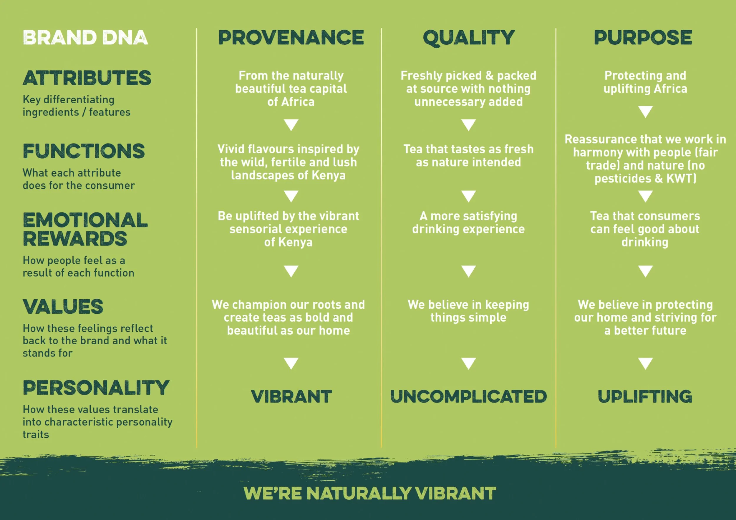
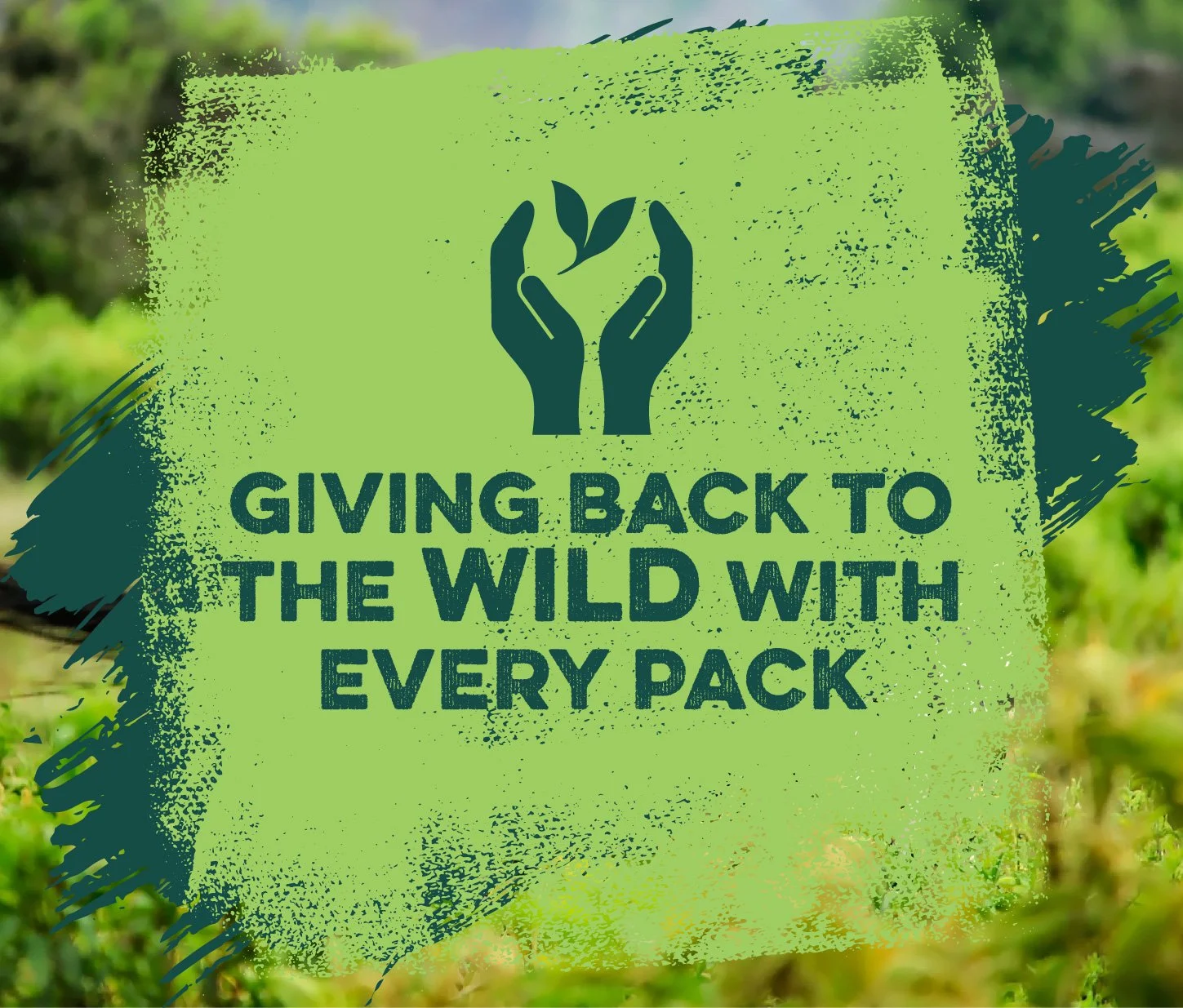
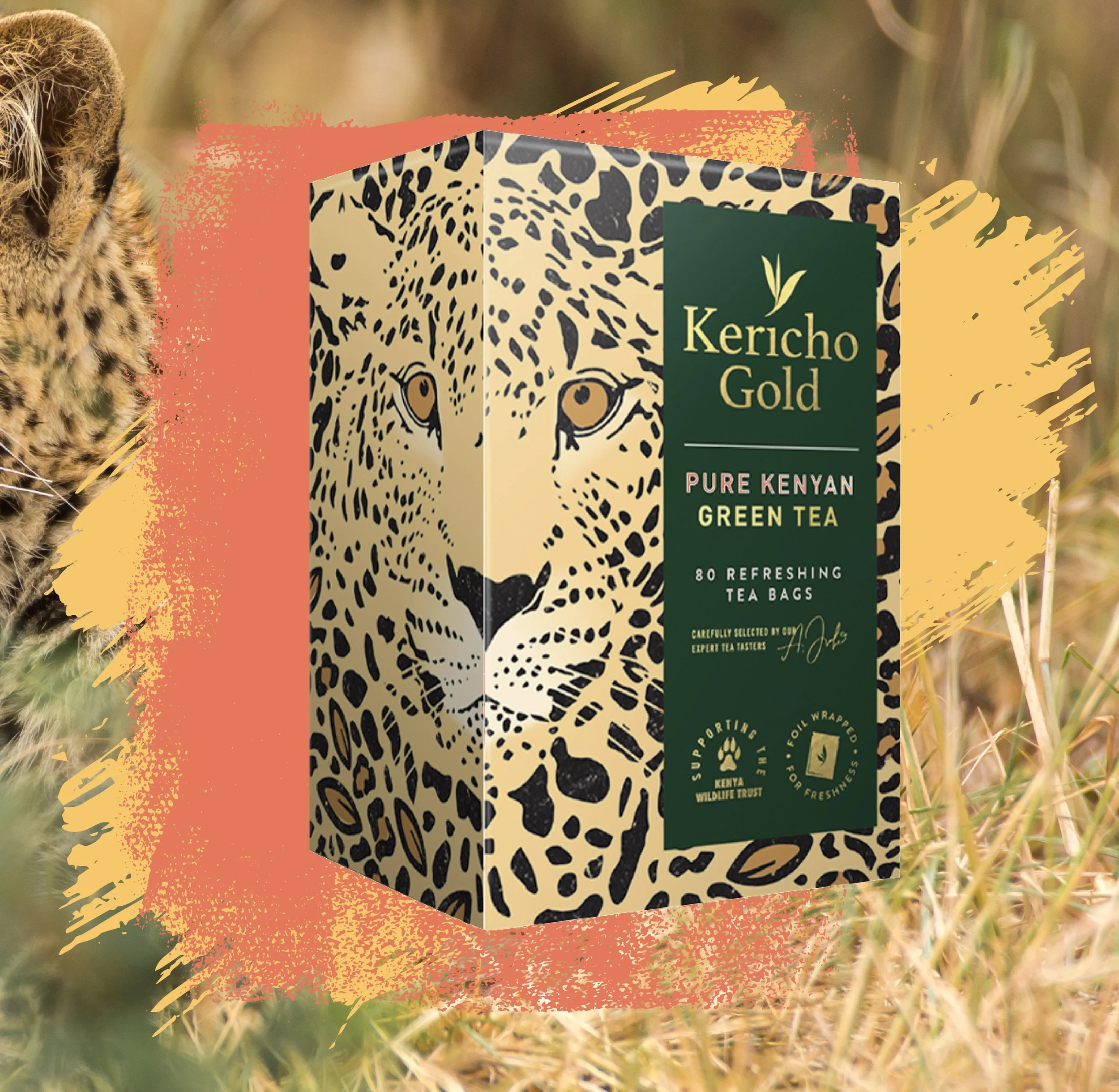
Kericho Gold creates tea that is as beautiful as their Kenyan home. Subsequently, this rebrand needed to reflect the naturally vibrant spirit of Kenya.
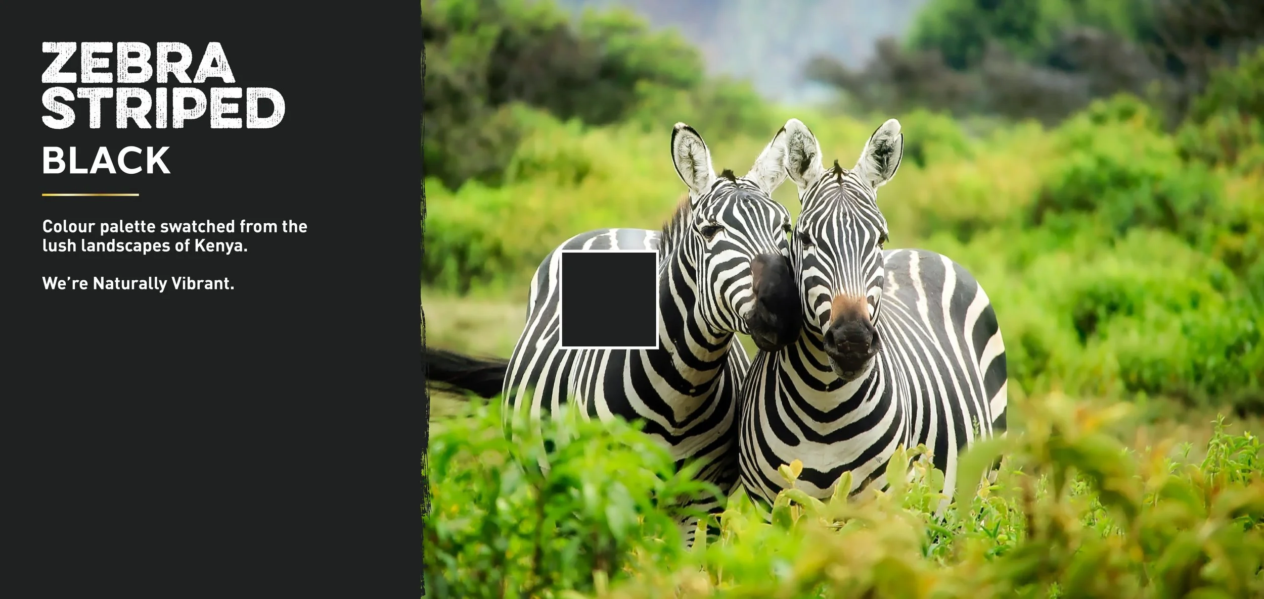
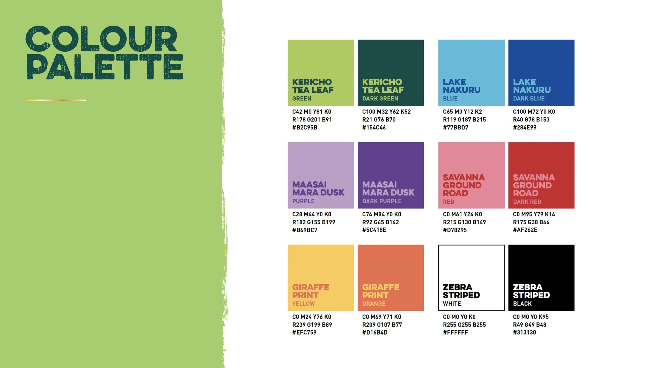
I designed the new look & feel to echo the lush landscape of Kenya by introducing a colour palette directly inspired by the wild. For example, I selected the new blues from the fresh waters of Lake Nakuru and I swatched the new purples from the impressive sunsets at Maasai Mara. In fact, all my design choices were inspired by the Kenyan landscape: by introducing textured typography and utilising dynamic landscape imagery, to name a few. Kericho Gold has an inspiring brand story, where they continuously strive to protect Kenyan wildlife. I wanted to champion this story throughout this rebrand by using confident bold typography and uplifting imagery, which could then be easily applied across multiple platforms such as their website and social media.
This project was designed at ©This Way Up Design